Bilingual trifold brochure design and printing for DHL Aviation.
 Natalia Rodriguez |
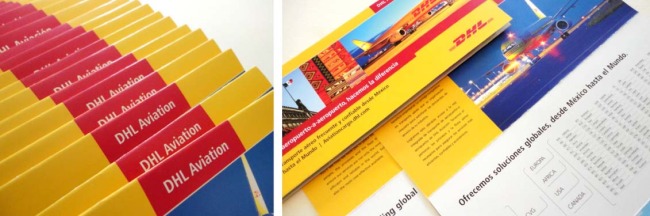
 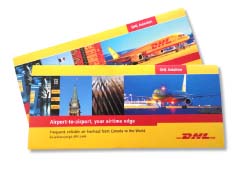 DHL Aviation is a branch of DHL that works with aviation cargo, airport-to-airport. We have designed a series of brochures to help promote their services and routes to specific markets, in this case Canada and Mexico.
The most important aspect of this project was to communicate the necessary content clearly, while adhering to DHL’s strict guidelines for corporate image and branding which are established by their headquarters in Brussels.
The design process started with the research of interesting aviation photography by international photographers to find the images that would showcase the DHL fleet in the most attractive way. This was followed by the selection of images relating to each specific market.
Maps and chart drawings were created and the brochure designs were prepared in two languages, Spanish and English, prior to high end printing and delivery.
For questions or information on logo design, branding and other projects, please contact:
natalia@studiorod.com | www.studiorod.com
Please like us on Facebook: https://www.facebook.com/studiorod