Intelligent Design and Branding for the Luxury Lifestyles industry
Connect With Us
Search
News

Entries in Illustration (4)

Tuesday
Jun102014

Designing artwork for Whole Foods Fort Lauderdale

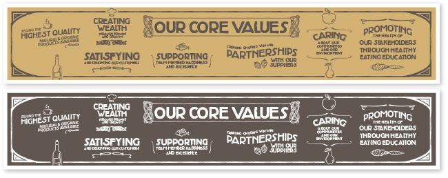
We’re very proud to share some of the design work we’ve recently done for Whole Foods Market for the Fort Lauderdale store. Our first project was the design of the Core Values graphic which included the 7 values and chalk-style illustrations (this is a fairly huge graphic that is displayed on a wall about 28 ft width x 5 ft height). The guidelines behind the artwork involved creating a look with a vintage, old-style inspiration, earthy colors, slightly distressed type, and a hand-crafted style. One of the most interesting aspects of the project was the combination of creative freedom and concept that each individual store has, along with maintaining the guidelines of their brand and corporate identity. The design process was fun every step of the way and we were privileged to work with such a creative and dedicated team.

For questions or information on any design projects, please contact:
natalia@studiorod.com  |  www.studiorod.com
Like us on Facebook: www.facebook.com/studiorod
Wednesday
May152013

Fun logo design for kids’ education product and its parent company.  

One of our favorite recent projects is the logo design and branding for The Motivated Child and its owner company The Smart Parenting Company. Developed by South Florida former teacher and tv news personality, Jaylene Garau, The Motivated Child is a motivational product for children 3–11 that teaches kids to make good choices in areas that range from behavior at home, to homework, discipline, hygiene, and more. The boxed set is packed with colorful charts, rewards, instructions and tips that are fun for parents and kids alike.


When they came to us, Smart Parenting had no identity of its own and the new edition of The Motivated Child was nearly on press and in need of a more exciting logo on the boxes. Our challenge was to create stronger branding with a future outlook, while making sure the new designs fit seamlessly within the existing packaging. Needless to say, the timeframe was tight with the boxes nearly printed but in need of new logos.

For The Motivated Child we suggested developing a set of two characters: a pair of wise owls that appeal to both parents and kids, and speak of the wisdom that comes from learning essential discipline skills. For Smart Parenting we drew from the idea of the owls to create a smaller icon of intelligent eyes. The Smart Parenting logo can now stand on its own and be part of any new products, but it retains a tie to the original owls.

What makes the new logos so special:

  • Adding illustrations brings life into the product.
  • The new logos help solidify both brands, by giving each a unique personality.
  • The new logos appeal to both parents & kids just like the product does.
  • The logos (as well as the product) introduce a “fun” approach to parenting and disciplining.
  • The new logos help communicate to parents that this product actually involves children in the process.
  • The new artwork helps kids relate to the product.
  • This product is “not another boring parenting book”, and the new logos set it apart.

Lots of successful companies understand that adding a little fun into the mix is positive and we were pleased to work with the very creative people of The Smart Parenting Company, who were able to work with us on these unique and exciting concepts.

For questions or information on any design projects, please contact:
natalia@studiorod.com  |  www.studiorod.com
Like us on Facebook: www.facebook.com/studiorod

Tuesday
Sep252012

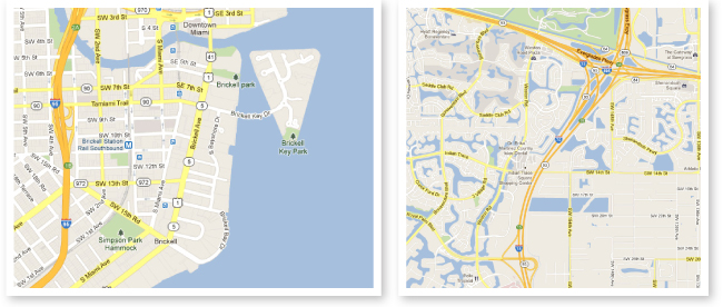
Custom drawn location maps help your readers focus on a destination.

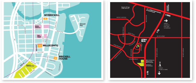
AFTER: Custom vector maps show specific locations of interest

BEFORE: Maps downloaded from the web show lots of details but miss out on highlighting key properties. Weston map data © 2012 Google. Brickell map data © 2012 Google, Sanborn.

A custom drawn map is more than a pretty picture, especially when you’d like to help your audience focus on a specific destination or location.

If the location you’d like to show is big (a city, for example), an illustrated map can include the most important roadways and points of reference and omit those that are unnecessary.

This has become useful in many industries and we frequently create custom vector maps for areas that range from a small city block, to a group of Islands, in order to help audiences visualize destinations.

Full navigation maps in your GPS can help you “get there” with precision, while an illustrated map, can give a reader a sense of overall location, without overwhelming detail. As an added bonus, an illustrated map can be “branded” in style, color and overall look, so that it becomes a unique an integral part of your business’ proposition and not just “something downloaded from the web”.

Vector maps can be fully edited, which makes them extremely practical visual solutions.

In real estate this can be of extreme value as it allows an agent, firm or developer to showcase the location of specific properties. KoRes Corp, a well known Florida-based real estate company, has understood this and have begun to include custom maps in their Premium Property Brochures, such as the two examples on this post, highlighting featured developments in Brickell, as well as commercial suites in Weston.

For questions or information on custom illustration and map projects, or to view zoomed-in map versions, please contact:
natalia@studiorod.com  |  www.studiorod.com
Like us on Facebook: www.facebook.com/studiorod

Saturday
Aug202011

New logo design for Traderock Corporation with a tropical flair. 

Traderock Corporation is a small business providing Food & Beverage Export Management and Consulting Services mainly in Latin America, Central America and The Caribbean.

While Traderock presently secures most of their business through their 17 years of experience and commercial relationships in the Food & Beverage Industry and Distributor Network, they realized that their business and name would be perceived as more solid and serious if his corporate image and brand were well designed.

The logo concept is to communicate trading and import and export of foods. We accomplished this through the "stamp/emblem" icon. We also wanted to give it a light latin flair that would resonate with the majority of the clientele and the pineapple illustration was the perfect artwork to do just that. 

They couldn't select a single color, because they loved the palette of 3 colors we provided in the last group of logo studies and so they decided to keep them all and use them as a logo system in different instances.

We're getting started on their website design and will post an update when it's ready.

For questions or information on logo design, branding and other projects, please contact:
natalia@studiorod.com  |  www.studiorod.com
Please like us on Facebook: https://www.facebook.com/studiorod