Intelligent Design and Branding for the Luxury Lifestyles industry
Connect With Us
Search
News
Tuesday
Jun102014

Designing artwork for Whole Foods Fort Lauderdale

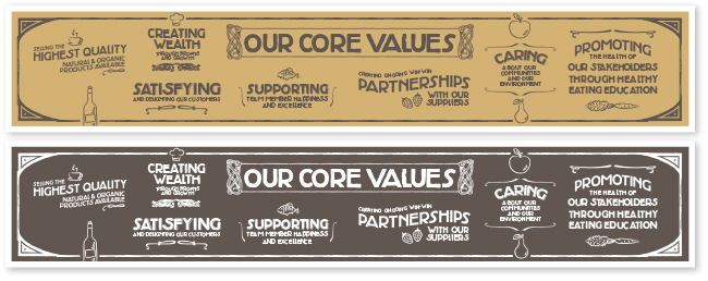
We’re very proud to share some of the design work we’ve recently done for Whole Foods Market for the Fort Lauderdale store. Our first project was the design of the Core Values graphic which included the 7 values and chalk-style illustrations (this is a fairly huge graphic that is displayed on a wall about 28 ft width x 5 ft height). The guidelines behind the artwork involved creating a look with a vintage, old-style inspiration, earthy colors, slightly distressed type, and a hand-crafted style. One of the most interesting aspects of the project was the combination of creative freedom and concept that each individual store has, along with maintaining the guidelines of their brand and corporate identity. The design process was fun every step of the way and we were privileged to work with such a creative and dedicated team.

For questions or information on any design projects, please contact:
natalia@studiorod.com  |  www.studiorod.com
Like us on Facebook: www.facebook.com/studiorod

Monday
Jun022014

New website design for 116' charter yacht Whisper

We recently wrapped-up the web design for the beautiful 116' Holland Jachtbouw Sloop Whisper. This stunning sailing yacht was in need of a new site to help them promote luxury charter vacations. Among their most important web design requirements:

• A clean, beautifully designed site, that was easy to read and navigate
• An easy to manage website that was simple to update by the client
• A broker-friendly website that any charter agent worldwide could share with clients without broker specific information being on the site
• An image oriented website that was easy to view on any device
• A blog integrated to the website for news and updates

Thanks to our extensive experience on yacht website design and through a strong collaboration with the yacht's management team, we quickly designed a structure that included 8 basic sections: from the introduction to the history of the yacht, technical details & specifications, activities & dining, favorite destinations, a complete photo gallery, crew page, and blog.

The charter-focused website includes interesting features such as:
Custom-drawn vector deck plans: showing the most important areas of the yacht to potential charter guests.
Favorite cruising itineraries: displayed as blog entries and also offered as downloadable PDFs that guests can keep on file.
Digital brochure: A professionally-designed interactive 8-page yacht charter brochure that readers can flip-through online, or download to keep.


The team at Churchill Yacht Partners was instrumental in coordinating the project. The yacht photography by renowned Billy Black was a visual treat to work with. You can visit the site at: www.whisperyacht.com

For questions or information on any design projects, please contact:
natalia@studiorod.com  |  www.studiorod.com
Like us on Facebook: www.facebook.com/studiorod

Wednesday
May282014

Finding the balance between work and personal life.

I am supporter of keeping personal life separate from work, but there are exceptions to that rule. As a business owner, artist and graphic designer, I am also a woman, wife and mother, recently blessed for the second time with a baby girl. 

Over the past few months I have felt increasingly guilty about not keeping the Studiorod blog updated, not staying on top of our Facebook page, not being very active on LinkedIn and other promotional projects that I had put on hold.

Life with a toddler and a newborn baby is beautiful but also time-consuming and at times a little complicated. When trying to figure out how to happily survive the initial period (which is usually the hardest), and most importantly how to get organized for this new chapter, I decided to focus on keeping family happy, and keeping clients happy. I also gave myself permission “not to do everything”.

To me this meant staying with the basics. I would work as hard as possible so my clients would continue to have the best of my creative skills, business sense and speed. And so for the past few months I have devoted all of my working time to my fabulous and most loyal clients.

Being a designer and a mom of two will require extra skills, which I am learning every day, but as I get more experience—and more sleep—I feel it’s time to do some of the self-promo things I enjoy and constantly recommend to clients. So I’m back to the blog and to sharing some of the wonderful work recently done, and who knows, maybe I’ll make more exceptions to share what I’m learning about how to brainstorm a new brand design with watercolors and crayons. 

One thing is certain, kids definitely keep our creative side alive, so my sketchbook is packed with great ideas and I’m excited about all the new projects in the works. 

For questions or information on any design projects, please contact:
natalia@studiorod.com  |  www.studiorod.com
Like us on Facebook: www.facebook.com/studiorod

Wednesday
May152013

Fun logo design for kids’ education product and its parent company.  

One of our favorite recent projects is the logo design and branding for The Motivated Child and its owner company The Smart Parenting Company. Developed by South Florida former teacher and tv news personality, Jaylene Garau, The Motivated Child is a motivational product for children 3–11 that teaches kids to make good choices in areas that range from behavior at home, to homework, discipline, hygiene, and more. The boxed set is packed with colorful charts, rewards, instructions and tips that are fun for parents and kids alike.


When they came to us, Smart Parenting had no identity of its own and the new edition of The Motivated Child was nearly on press and in need of a more exciting logo on the boxes. Our challenge was to create stronger branding with a future outlook, while making sure the new designs fit seamlessly within the existing packaging. Needless to say, the timeframe was tight with the boxes nearly printed but in need of new logos.

For The Motivated Child we suggested developing a set of two characters: a pair of wise owls that appeal to both parents and kids, and speak of the wisdom that comes from learning essential discipline skills. For Smart Parenting we drew from the idea of the owls to create a smaller icon of intelligent eyes. The Smart Parenting logo can now stand on its own and be part of any new products, but it retains a tie to the original owls.

What makes the new logos so special:

  • Adding illustrations brings life into the product.
  • The new logos help solidify both brands, by giving each a unique personality.
  • The new logos appeal to both parents & kids just like the product does.
  • The logos (as well as the product) introduce a “fun” approach to parenting and disciplining.
  • The new logos help communicate to parents that this product actually involves children in the process.
  • The new artwork helps kids relate to the product.
  • This product is “not another boring parenting book”, and the new logos set it apart.

Lots of successful companies understand that adding a little fun into the mix is positive and we were pleased to work with the very creative people of The Smart Parenting Company, who were able to work with us on these unique and exciting concepts.

For questions or information on any design projects, please contact:
natalia@studiorod.com  |  www.studiorod.com
Like us on Facebook: www.facebook.com/studiorod

Tuesday
May072013

We're back! Minimalist postcard design shows that less can be more.

This elegant postcard design promotes Horizon’s presence at Spring Boat Shows. 

First and foremost and apology to our readers as the last couple of months were super busy and we neglected our blog a little. We’re back and re-energized and ready to share a few of the designs and promotions that have kept us occupied.

With a clean and elegant postcard design, Horizon promotes its presence and invites guests and clients to the Spring boat shows in Miami and Palm Beach, Florida. 

The minimalist approach showcases the Horizon quality and lifestyle, while proving that less can be more. An uncluttered layout with ample white space allows readers to focus on the brand name and the stunning yacht photography and offers a peaceful parenthesis in an otherwise busy mailbox, subtly beckoning the attention of readers.

The 6x9 postcard design is a breeze to mail, the overall gloss uv varnish on the front makes for a shiny presentation, while the plain finish on the back is perfect for addressing and postage.

For questions or information on any design projects, please contact:
natalia@studiorod.com  |  www.studiorod.com
Like us on Facebook: www.facebook.com/studiorod